Redesigning Lumeto’s desktop interface for immersive VR roleplay
Date: Jan 2022 - June 2022
Role: UX Designer, UX Researcher
How it works
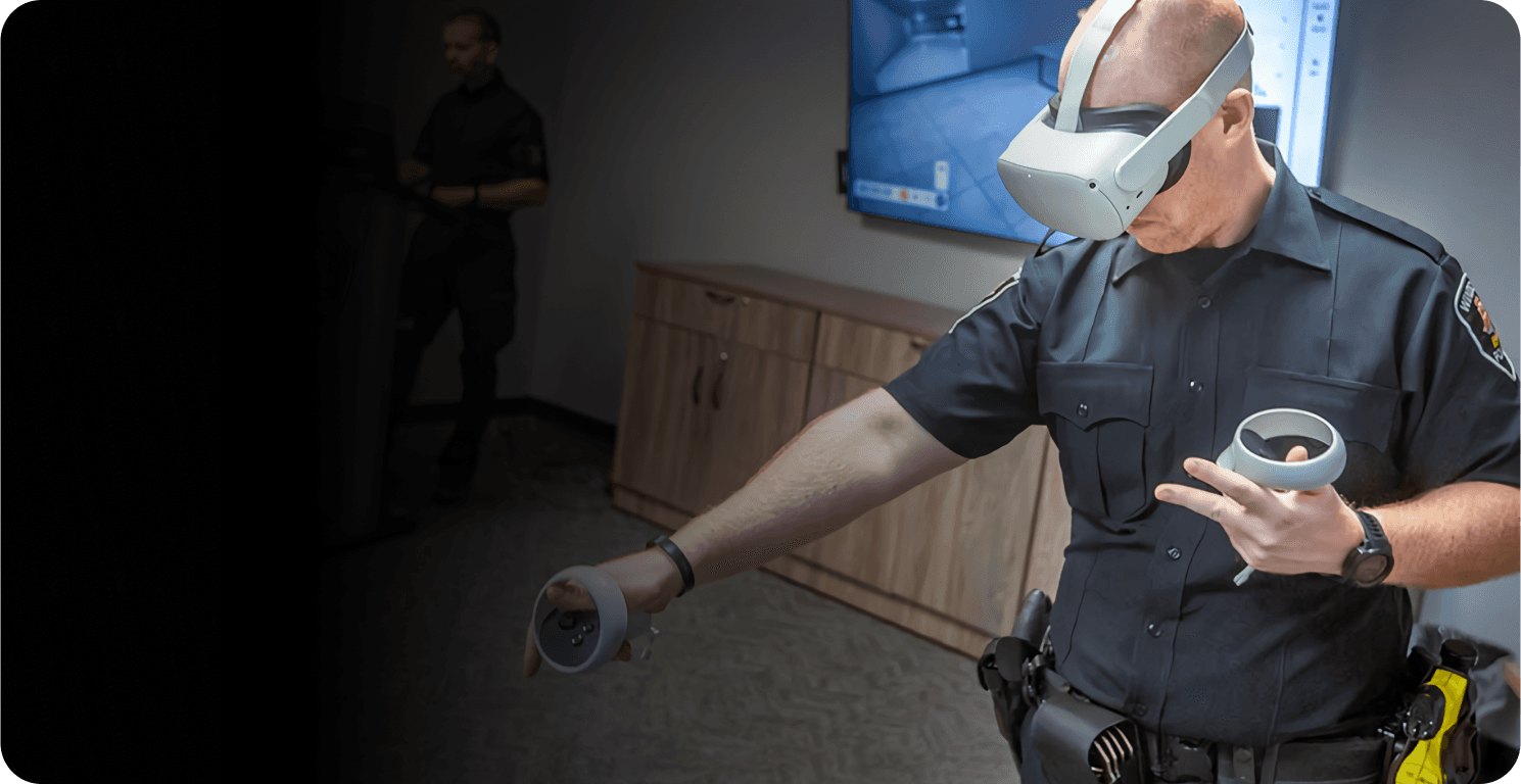
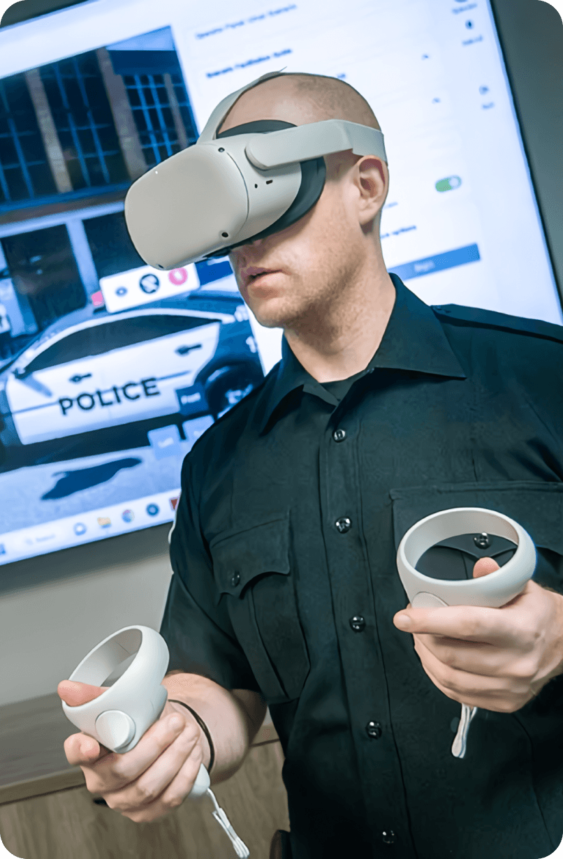
Immersive VR Training
1
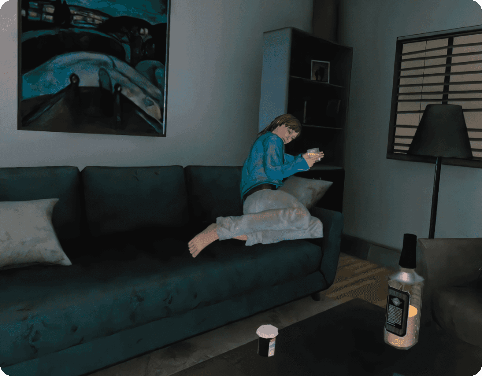
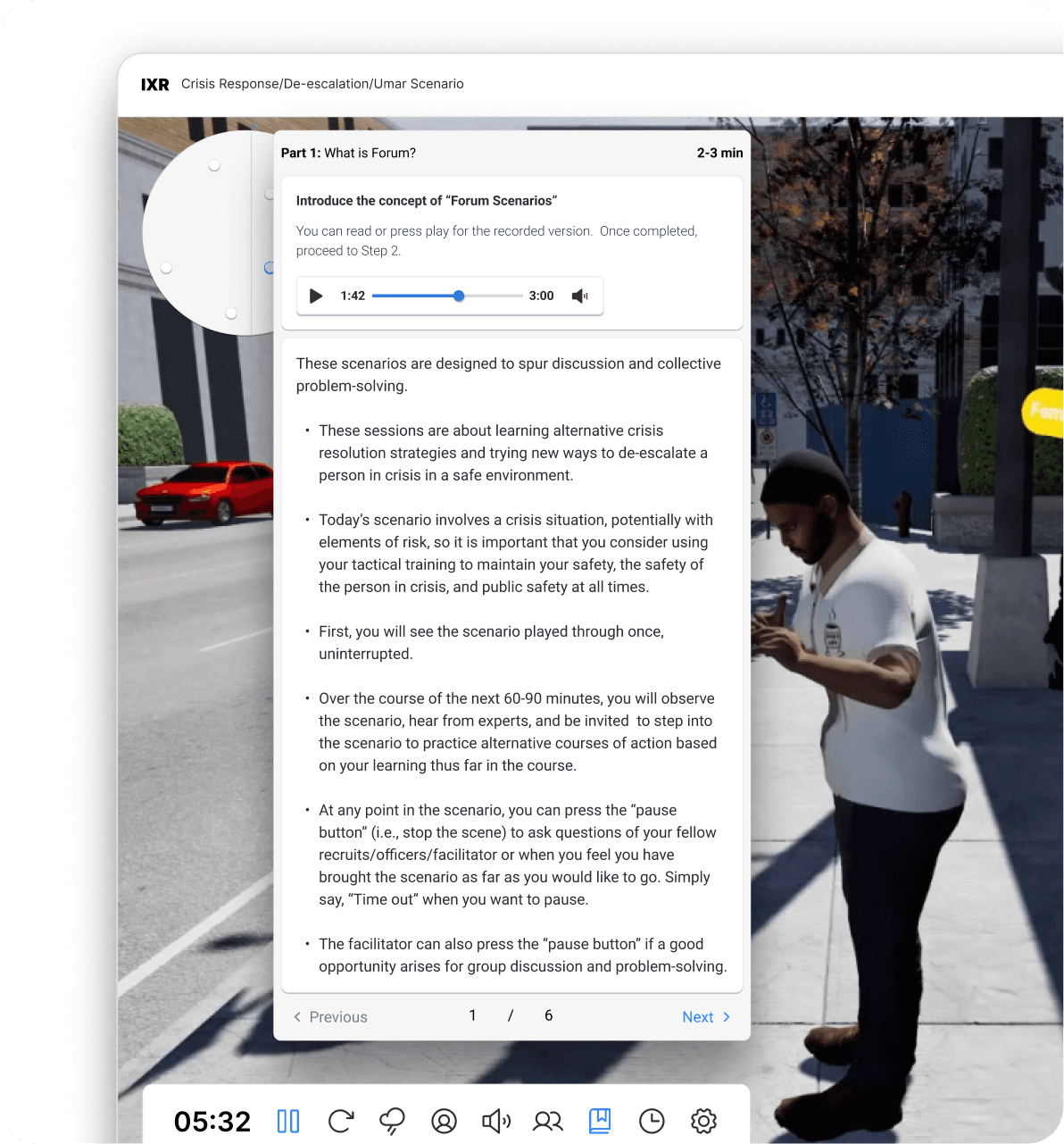
Learners roleplay to de-escalate mental health crisis scenarios
Immersive VR Training
1
Learners roleplay to de-escalate mental health crisis scenarios

2
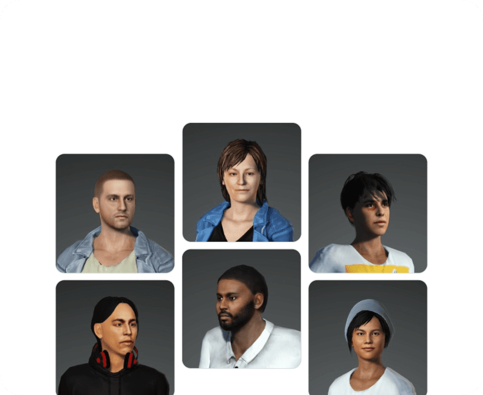
6 Unique Scenarios
2
6 Unique Scenarios
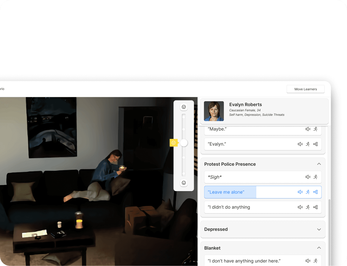
3
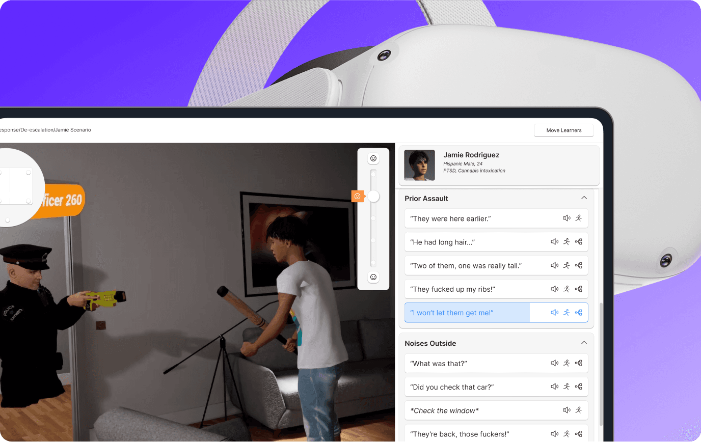
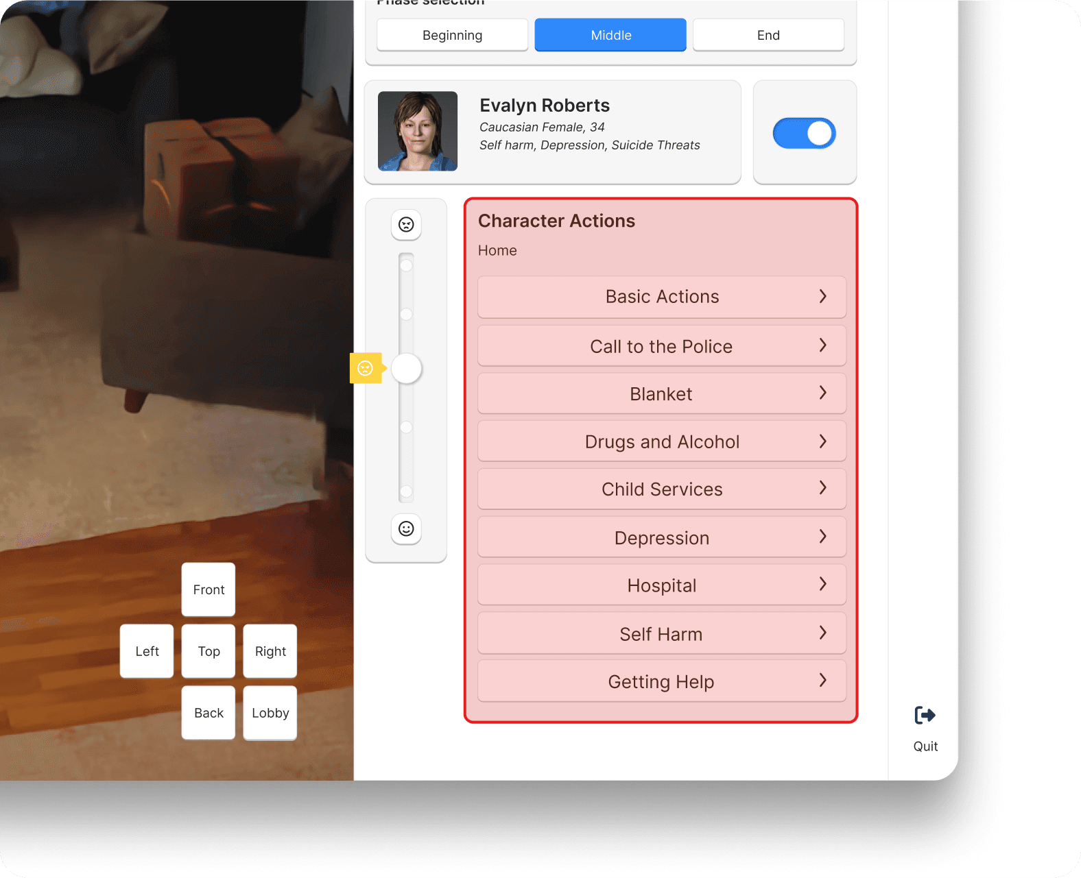
Interactive Person in Crisis
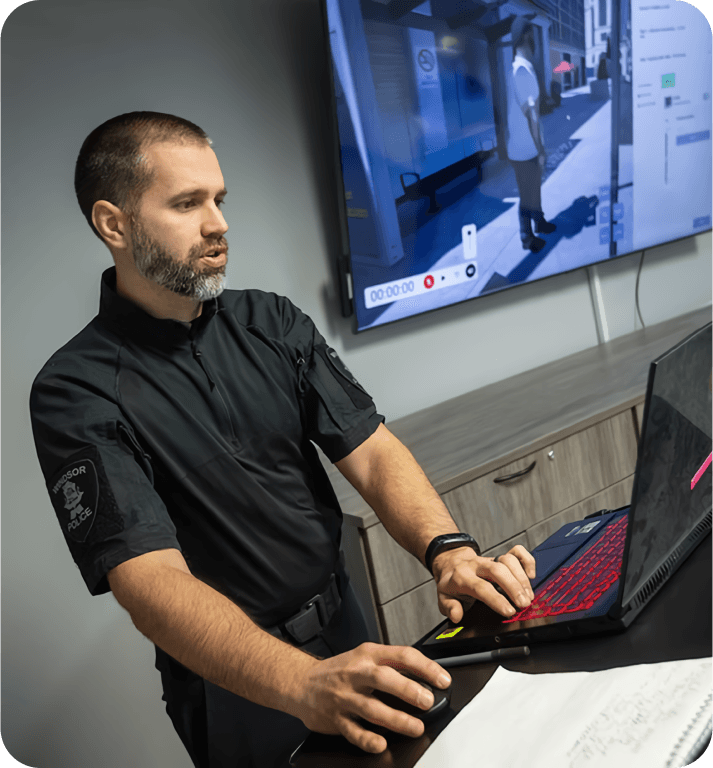
Trainers control the actions and responses of the person in crisis to test their learners from our desktop app.
3
Interactive Person in Crisis
Trainers control the actions and responses of the person in crisis to test their learners from our desktop app.
Impact
1
25%
Less user error
Clearer actions for the Person in Crisis allowed greater intentionality from our Trainers, and more graceful error recovery
2
25%
Faster acclimation
Additional tutorials paired with a increased learnability in the Trainer interface allowed Services to get up and running faster
3
80%
Less time spent during navigation
More effective pre-set cameras, paired with a more intuitive method of interaction allowed trainers more time to focus on controlling the Person in Crisis
4
50%
Increased satisfaction
Between our previously onboarded early adopters, and newly acquired Police Services, the new changes were well recieved
My role

Boost engagement and retention among new users
Following the launch of the Crisis Response product, our LiveOps team began engaging with newly acquired Police Services and began onboarding them to our product. Early in to this process, we were noticing an issue with user retention.
Boost engagement and retention among new users
Following the launch of the Crisis Response product, our LiveOps team began engaging with newly acquired Police Services and began onboarding them to our product. Early in to this process, we were noticing an issue with user retention.
1
Low retention rate among new users
Our data suggested that Police Services that had not participated in previous testing rounds, or that were outside of our early adopters were experiencing a decrease in product usage shortly after onboarding.
2
Low engagement rate
Among many of the new Police Services onboarded to the product, that rate of use of the product was significantly less than our earlier adopters.
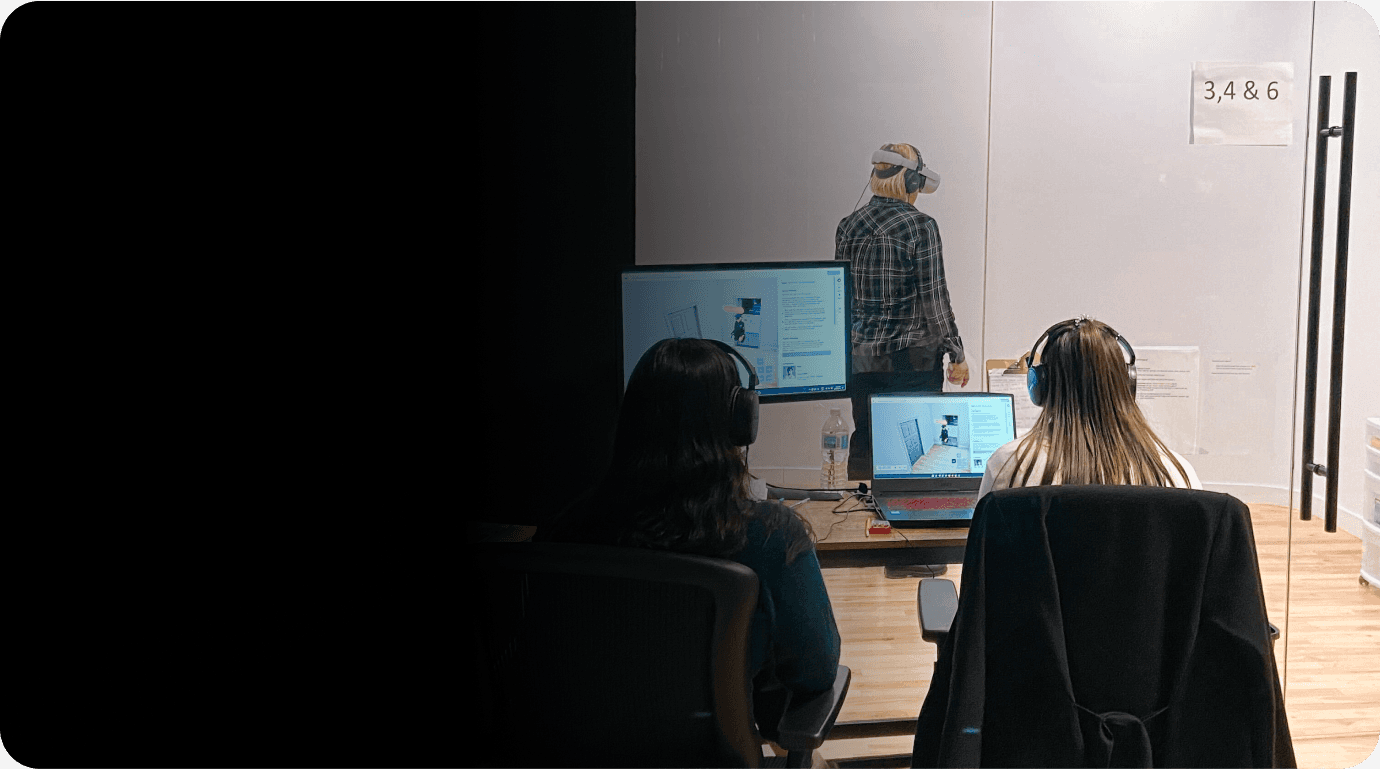
Research
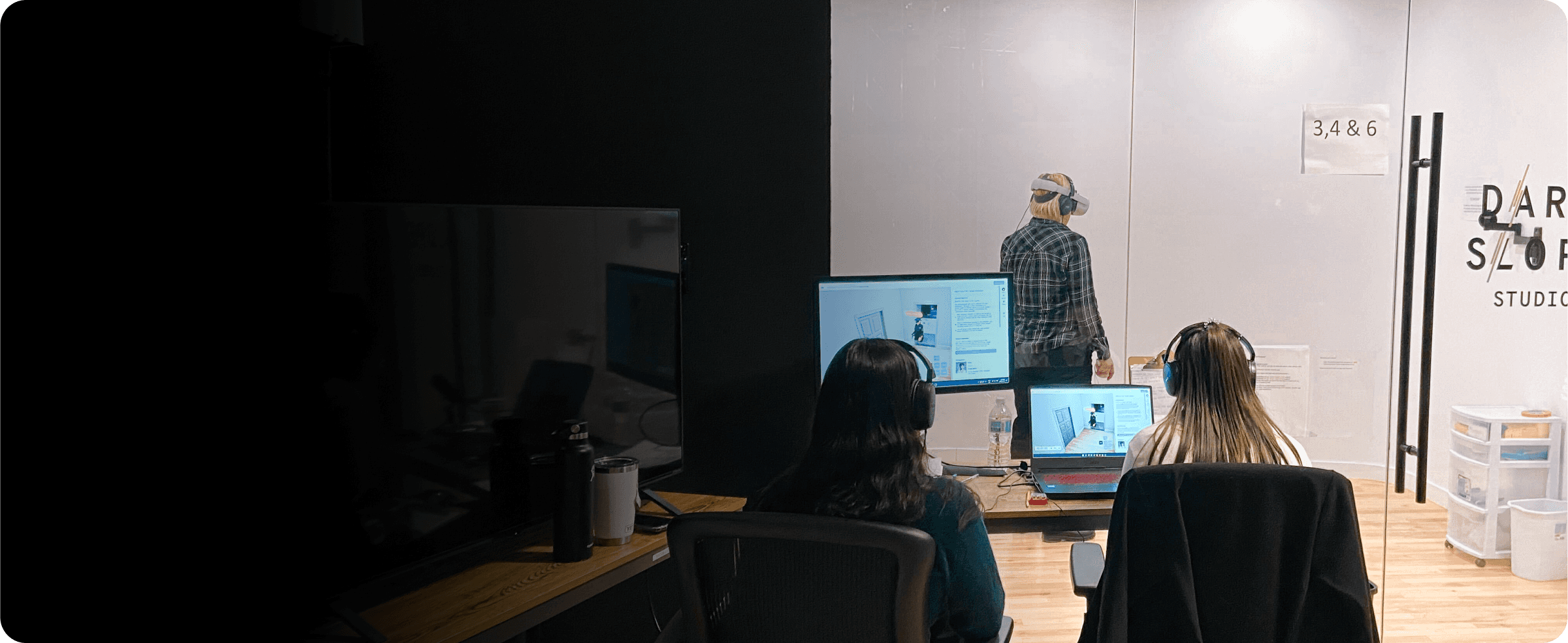
Live user testing at our studio
Live user testing at our studio

Research data collected and analyzed in dovetail
Research data collected and analyzed in dovetail
Usability test footage
37 hours
Participants
43 users

Insights
2
Insufficient emphasis of critical features
Trainers found that the vast majority of their attention was directed at the Dialogue and Actions, diverting their attention from the Viewport and the actions of the Learner.
In order to allow the trainer to make intentional decisions about the actions of dialogue of the Person in Crisis, they needed to be presented with as much relevant information as possible without an unnecessary increase in cognitive load. We needed to present this information in a way that was intuitive yet rich and informative.
3
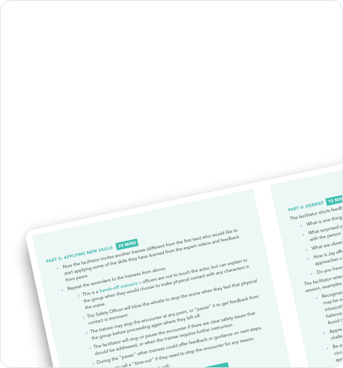
Ineffective user guides
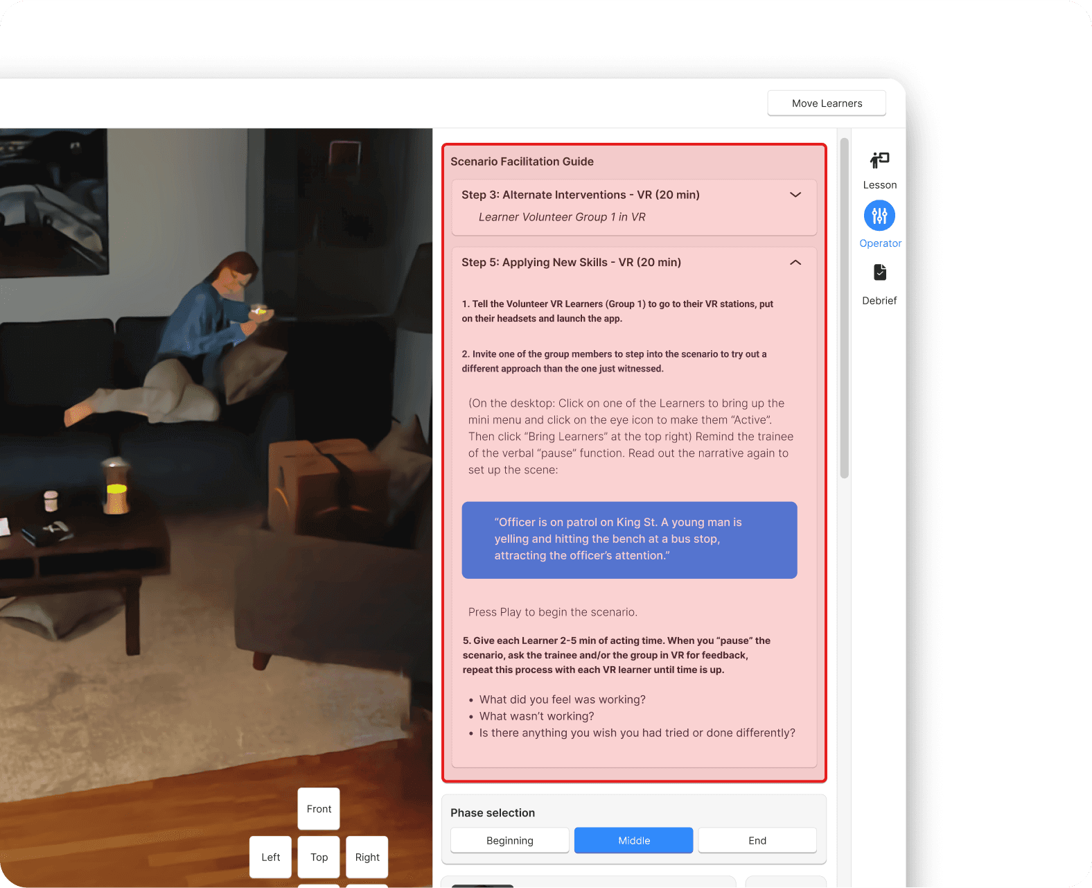
Trainers found the facilitation guide hard to navigate, difficult to read, and ineffective while interacting with Learners mid-scenario. With the guide constrained to the sidebar, a user would not be able to read the guide and control the Person in Crisis without needing to scroll back and forth between each feature.
Due to the fast-paced nature of the Trainer’s interactions with the Learner, we needed to ensure the Person in Crisis Control Panel UI only emphasized elements and information that was critical and urgent during simulation.
4
Unintuitive navigation
The pre-set camera controls were both ineffective for Trainers and unintuitive to navigate. An update to their design had been previously de-scoped, causing the feature to be significantly outdated. Additionally, while using the WASD control scheme for navigation is standard among games and other desktop experiences, it represented a significant learning curve for Trainers unfamiliar with this paradigm.
Participating in the live onboarding process allowed me face-to-face time with our users to observe them using the product as well as conduct interviews and collect survey data. It was discovered that many of the smaller, less funded Police Services had far less time for training and practice than was anticipated.
These users were finding the intricacies of the new curriculum, the new training modality, along with the learning curve of the software to be overwhelming.
1
Underfunded Police Services have less time for training
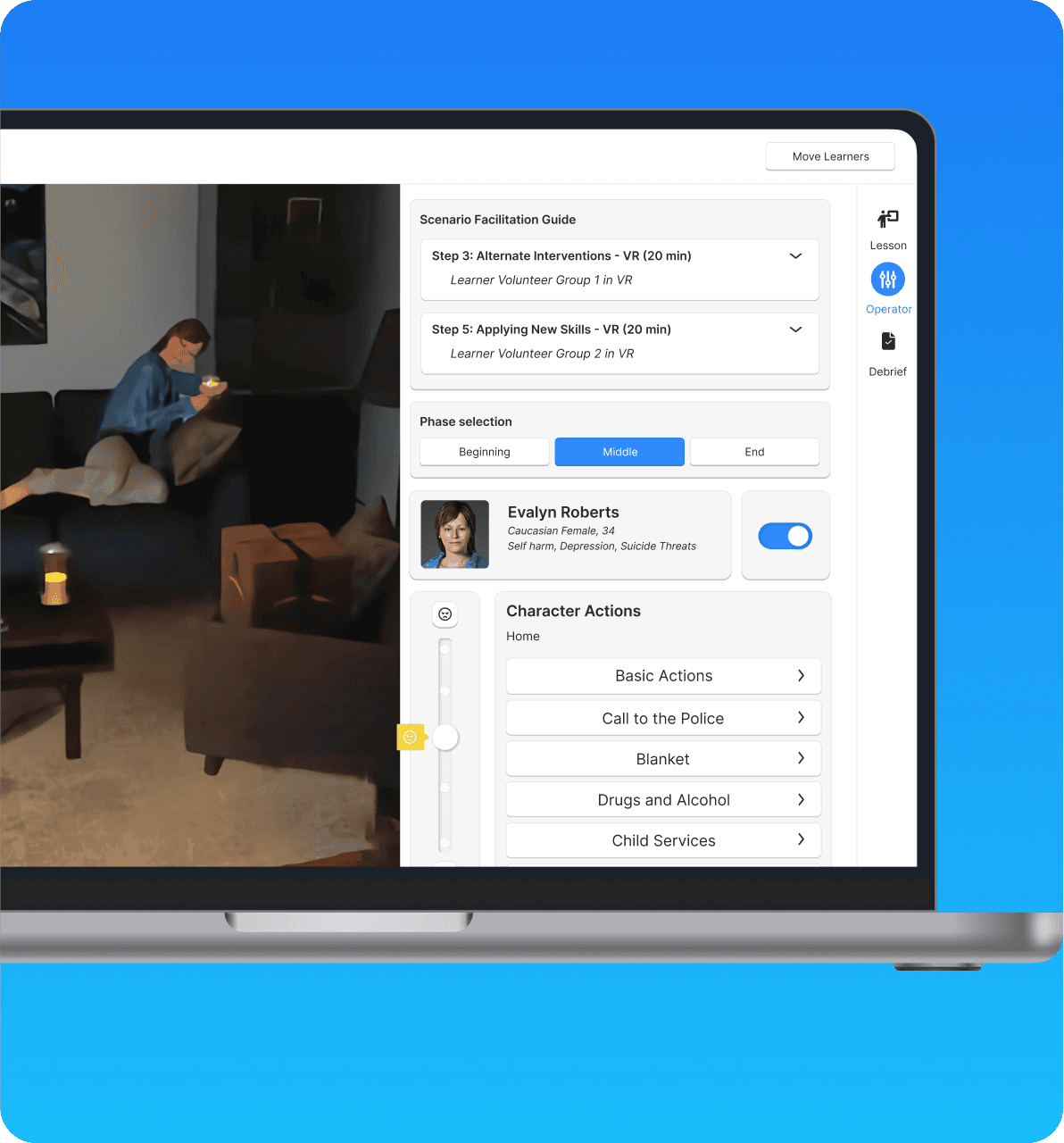
Final design
Dialogue brought into focus
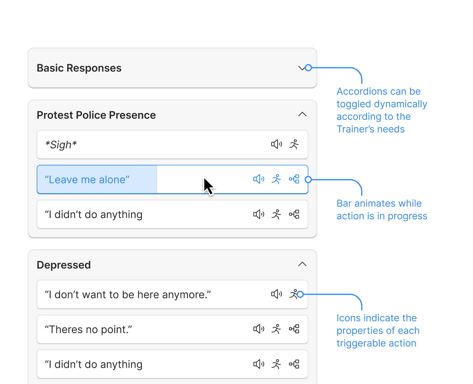
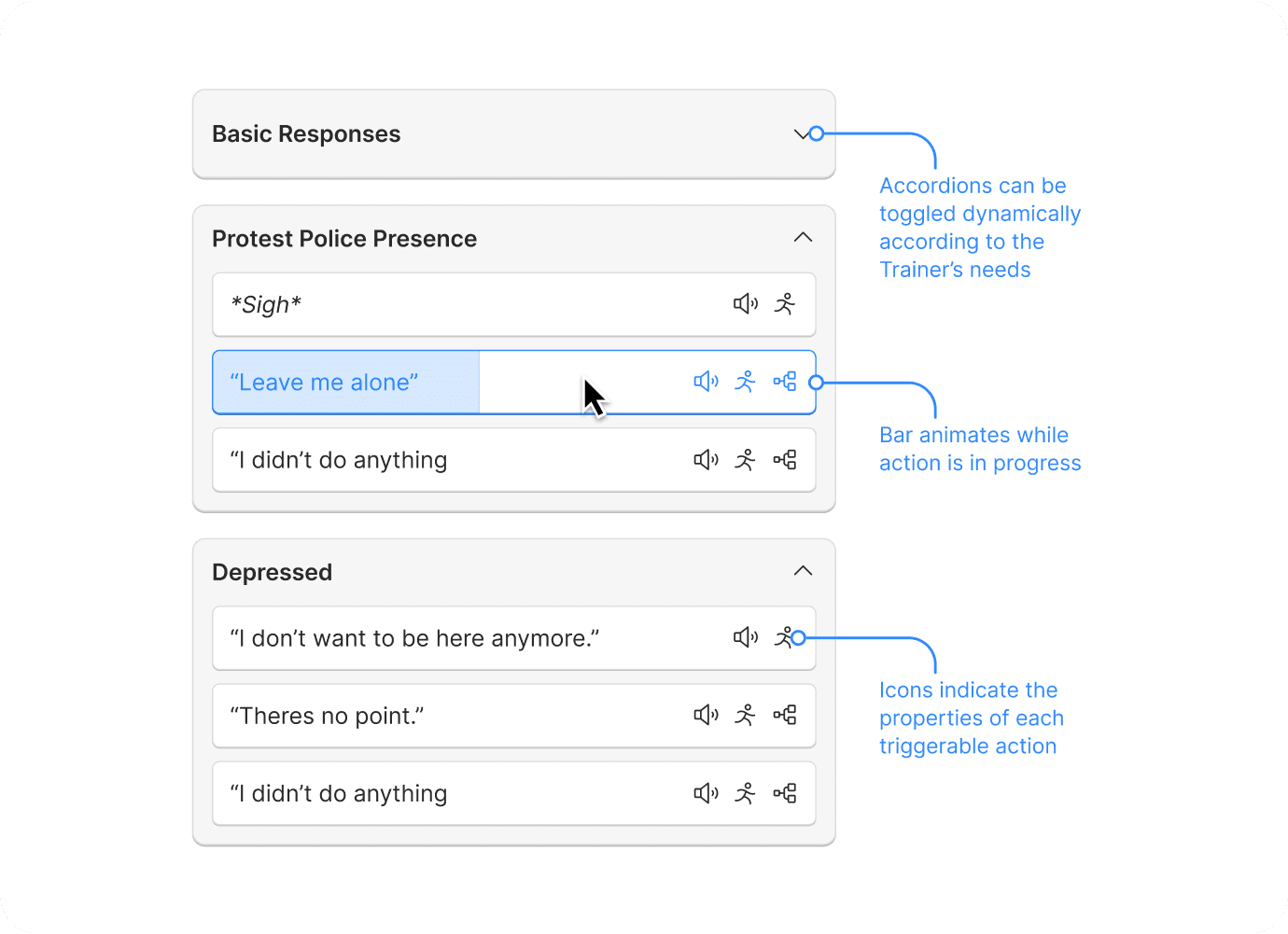
1
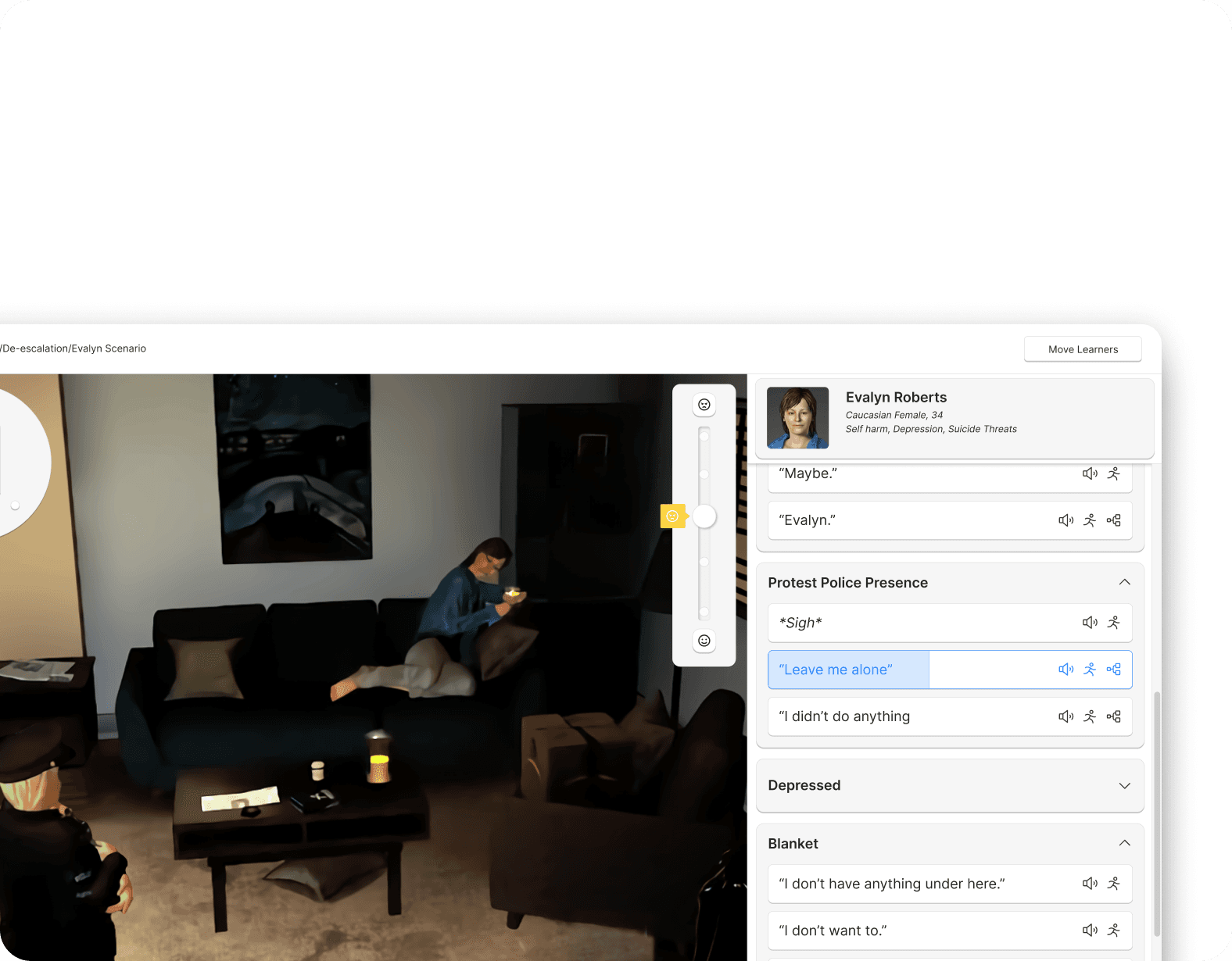
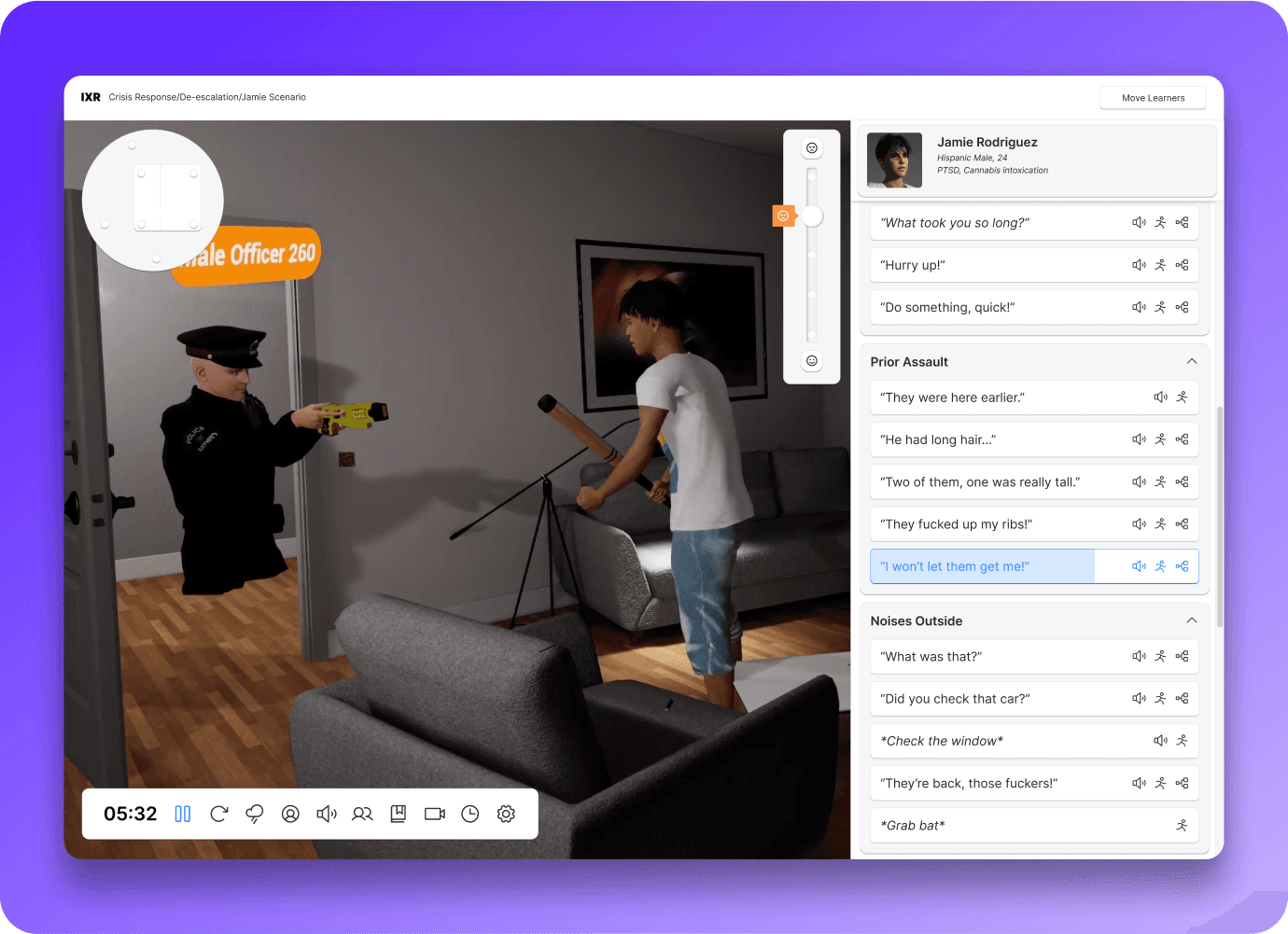
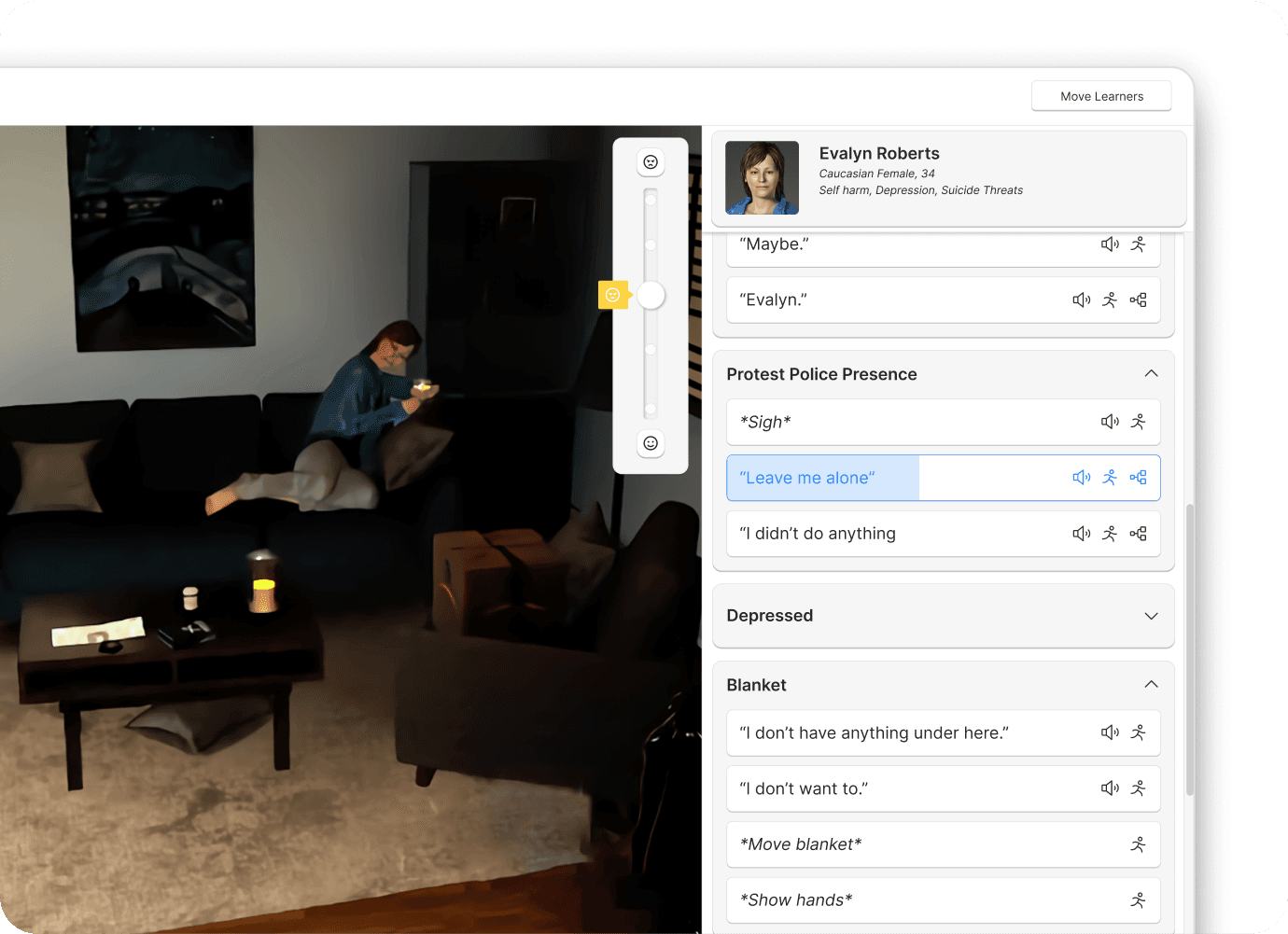
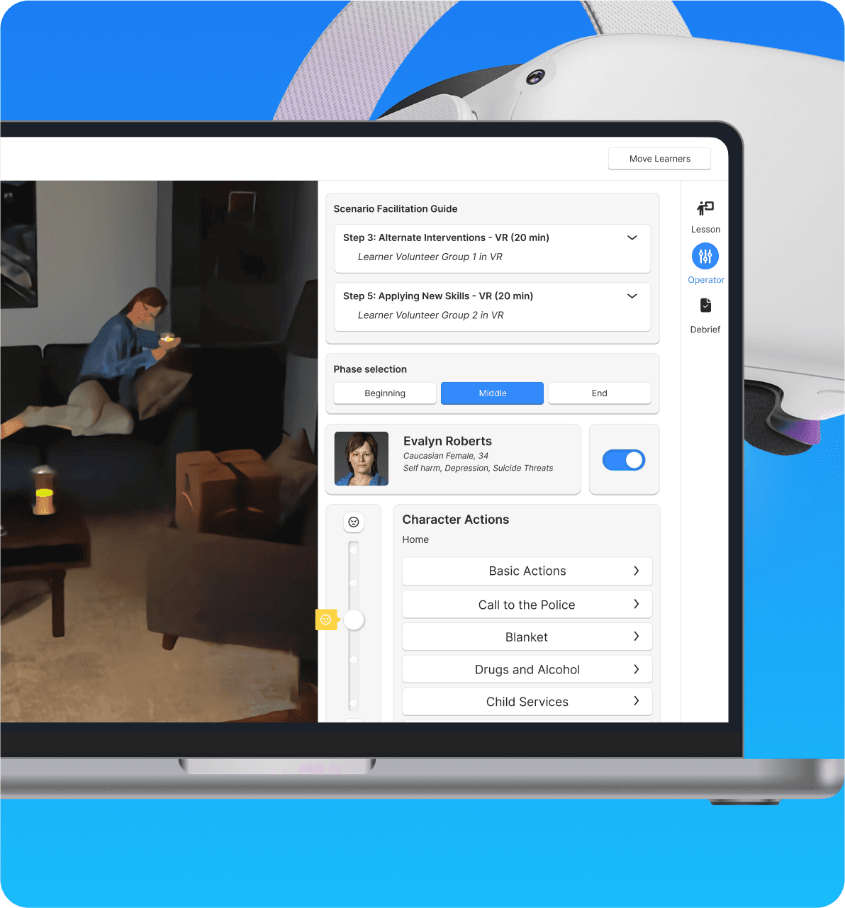
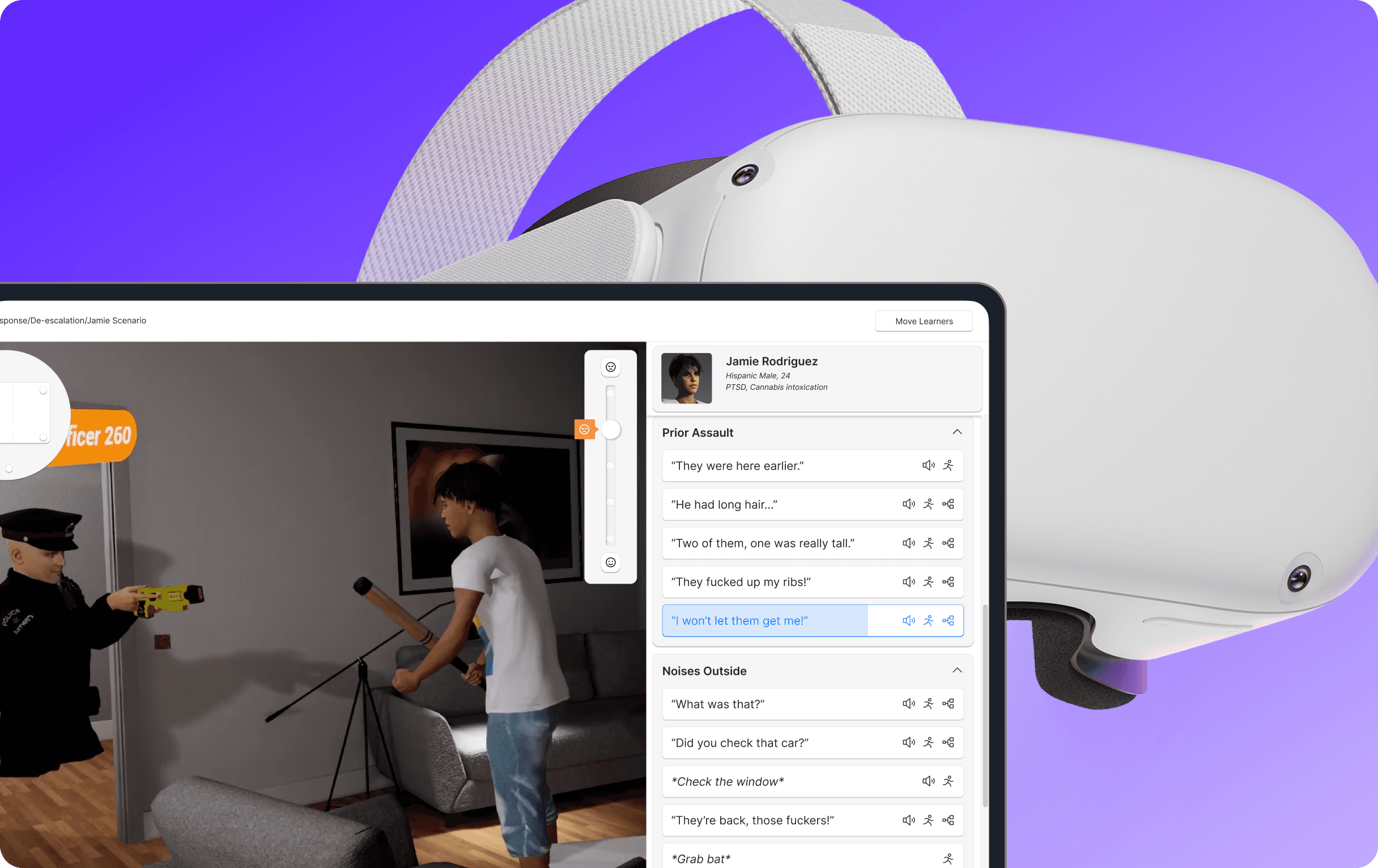
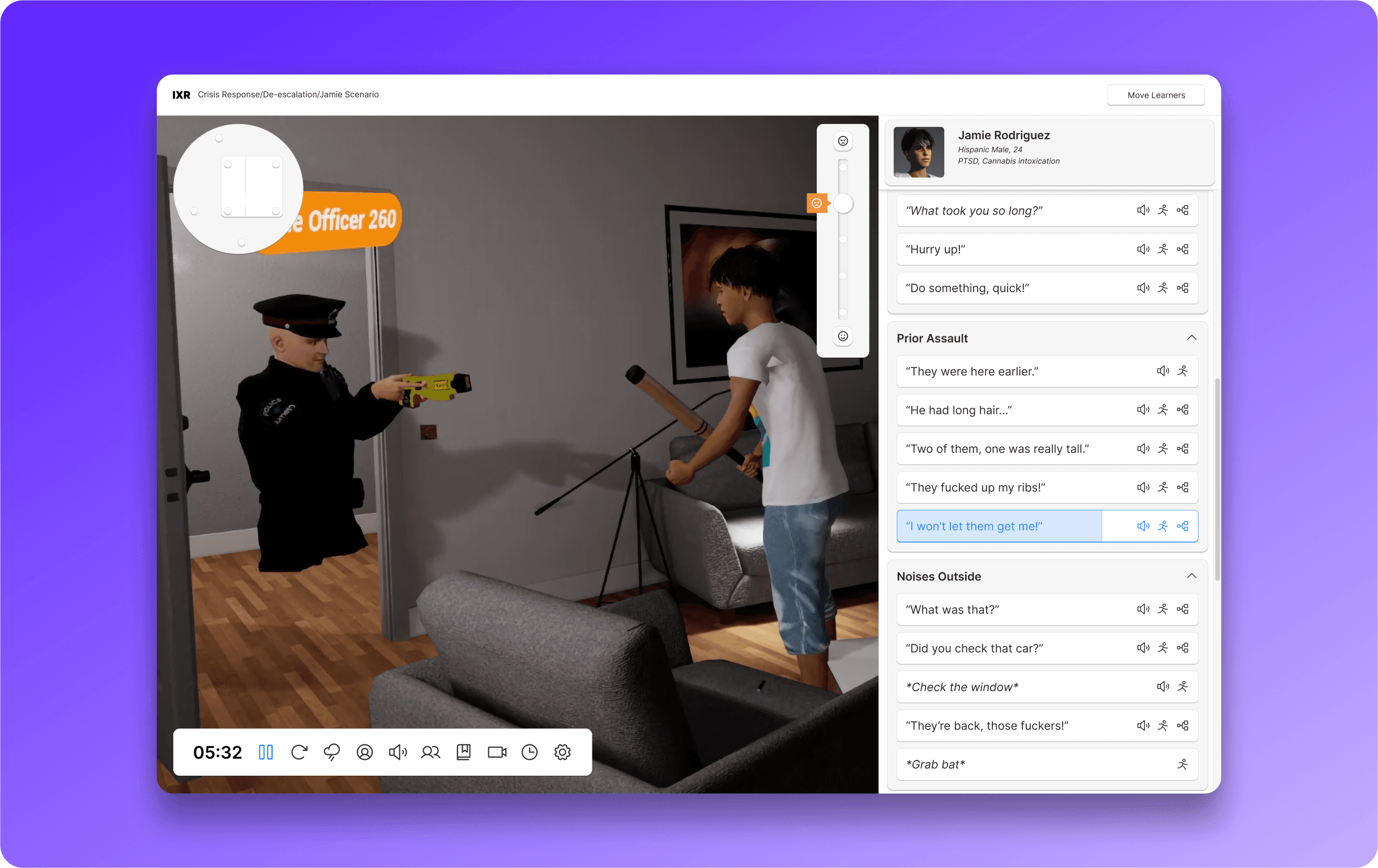
By removing other features from the sidebar, we were able to maximize the space for Actions and Dialogue. A variety of treatments were applied to actions such as, a longer text field, icons to denote action type, an animating status bar while the action is in use. This drastically increased visibility as well allowing the Trainer to make more informed and intentional decisions while controlling the Person in Crisis without increasing their cognitive load.
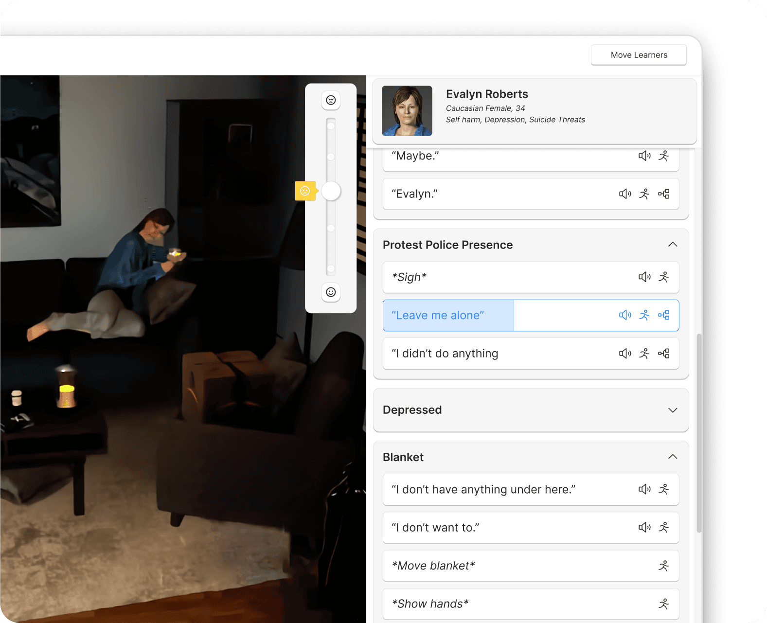
Dialogue
Action
Variable
Looping
Movement
Key Action
2
Guidance only when you need it
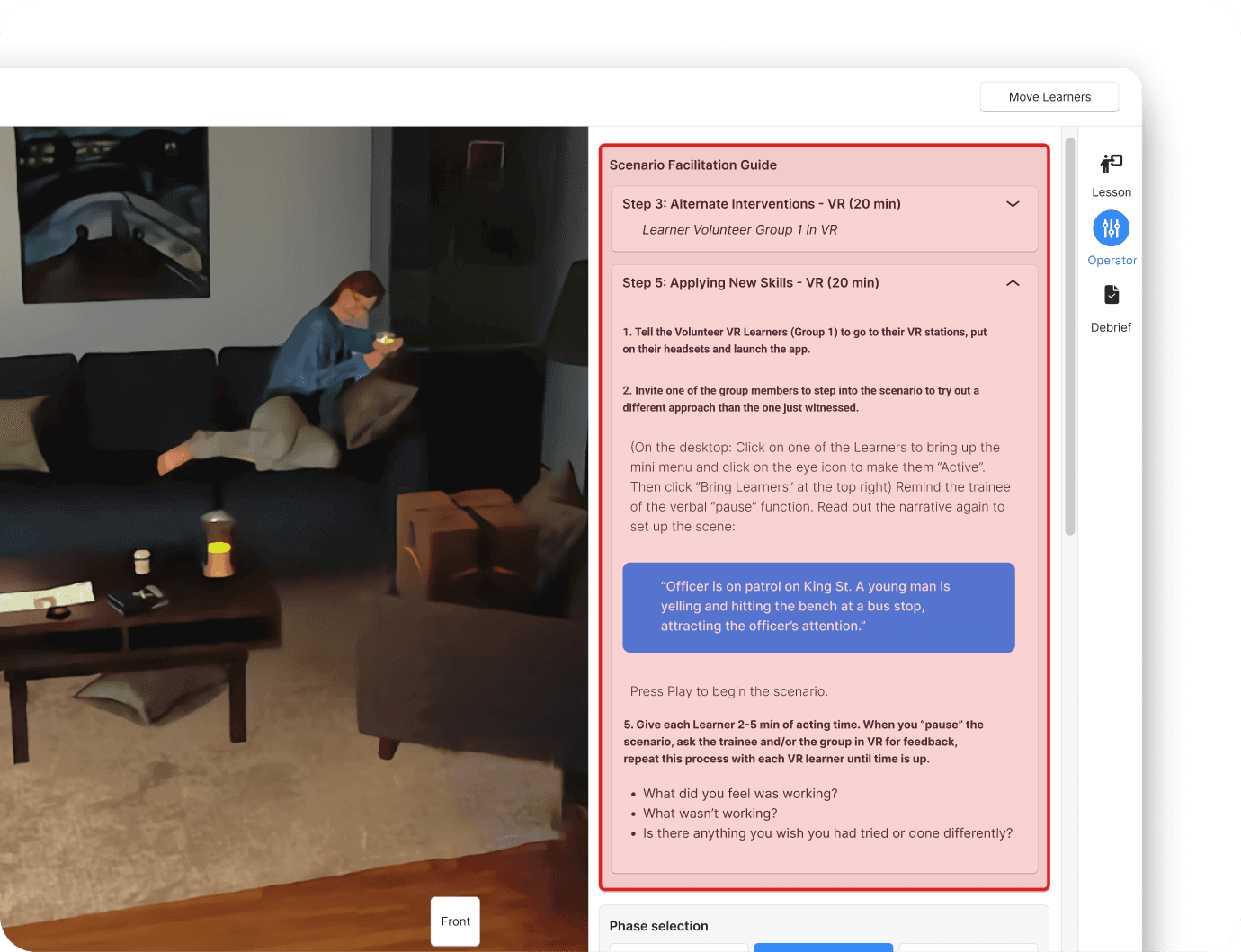
The facilitation guide was only needed during stages of the simulation when learner's weren't roleplaying in VR. It made sense to separate it from the Actions and Dialogue panel so the two features wouldn't be competing with one another for space or attention
2
Guidance only when you need it
The facilitation guide was only needed during stages of the simulation when learner's weren't roleplaying in VR. It made sense to separate it from the Actions and Dialogue panel so the two features wouldn't be competing with one another for space or attention
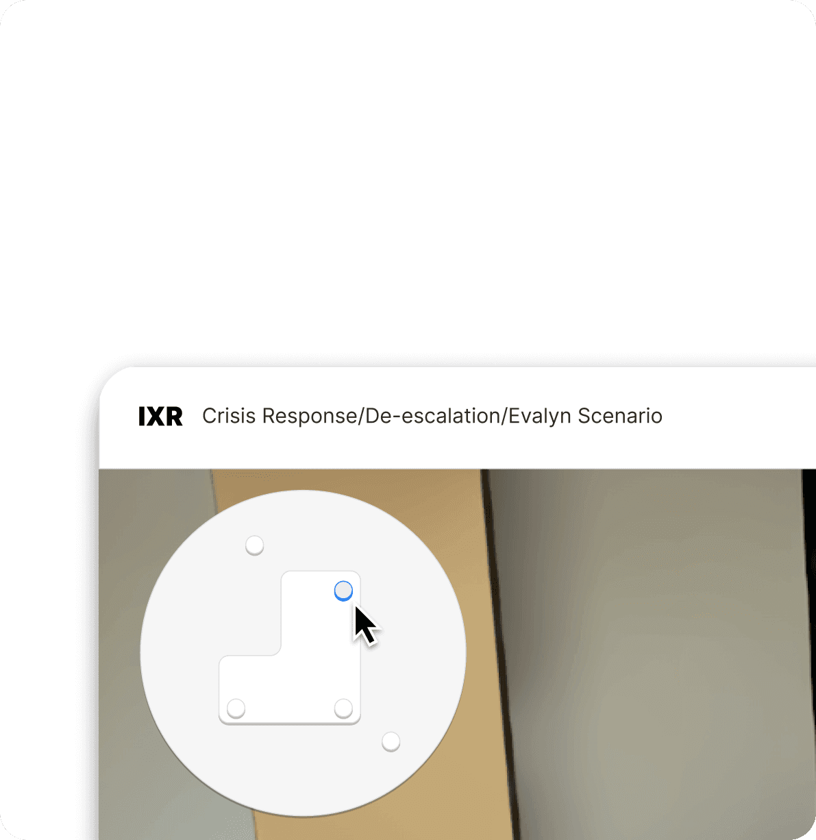
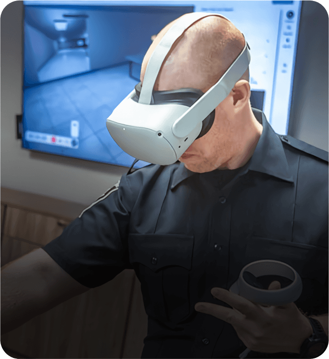
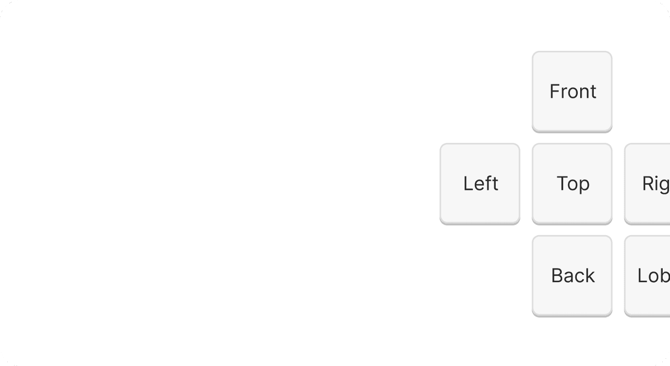
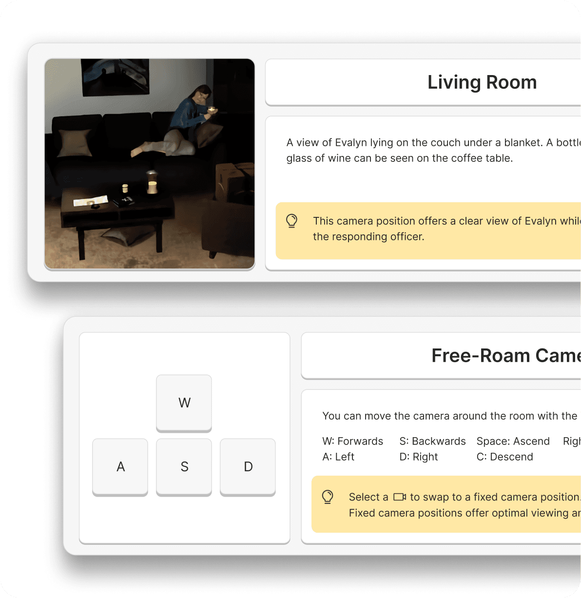
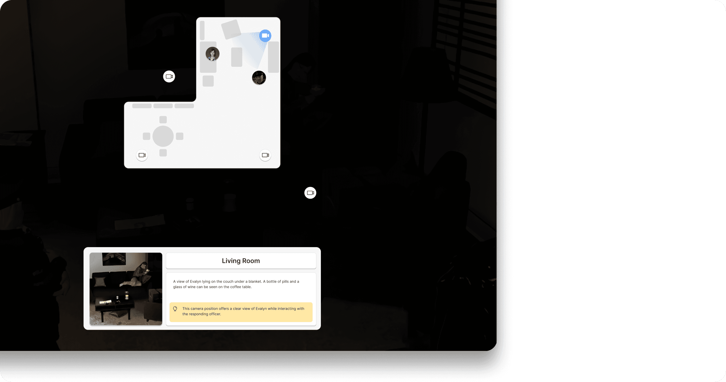
Navigation made easy
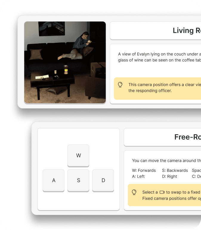
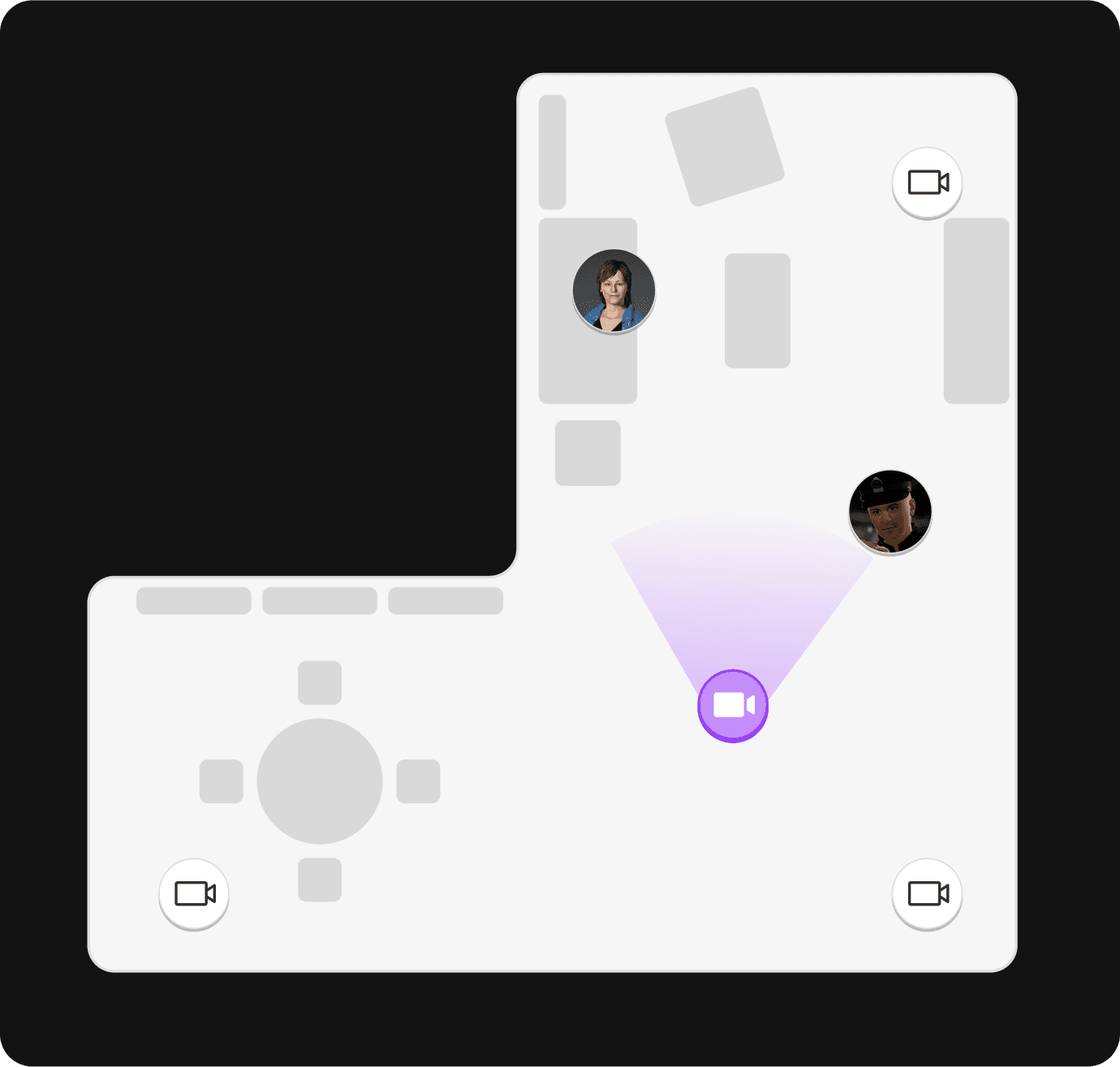
3
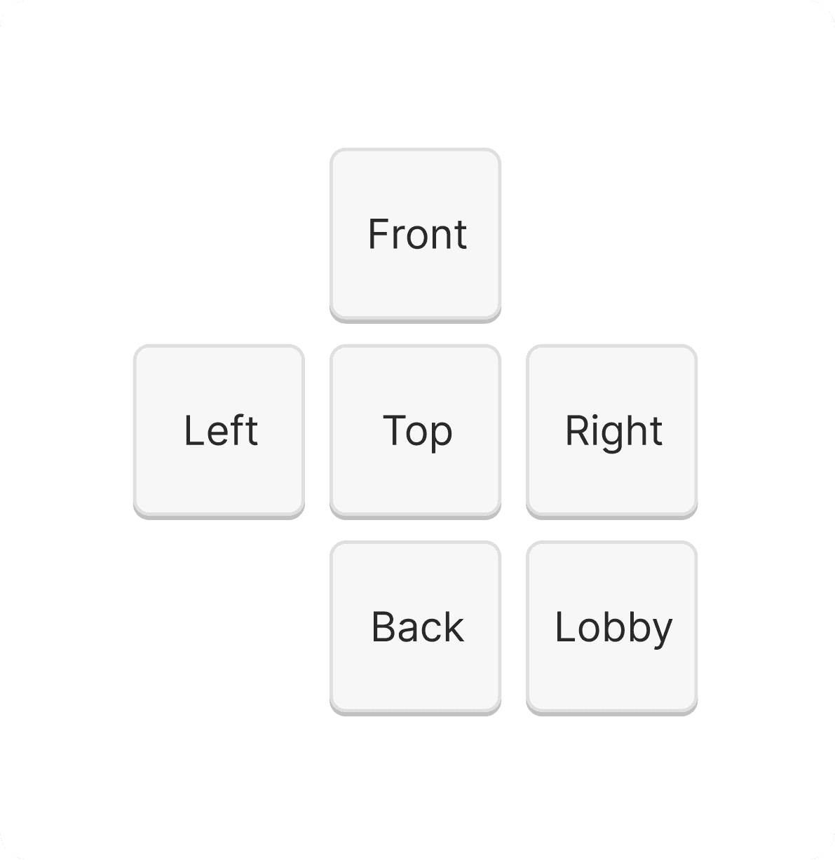
Trainers can switch between pre-set camera positions by clicking their position on the mini-map.
Navigation made easy
3
Trainers can switch between pre-set camera positions by clicking their position on the mini-map.
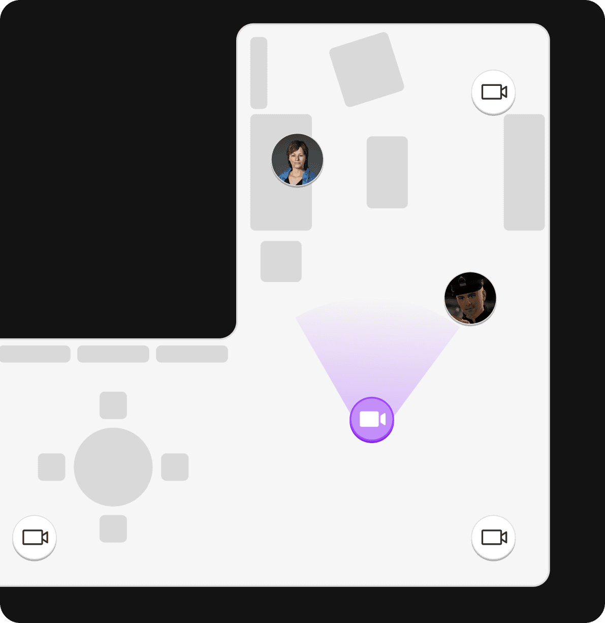
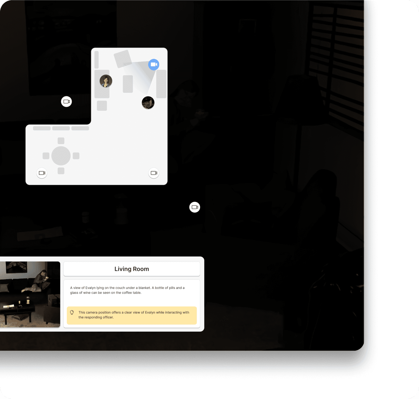
Make tactical decisions faster with top-down map overlay
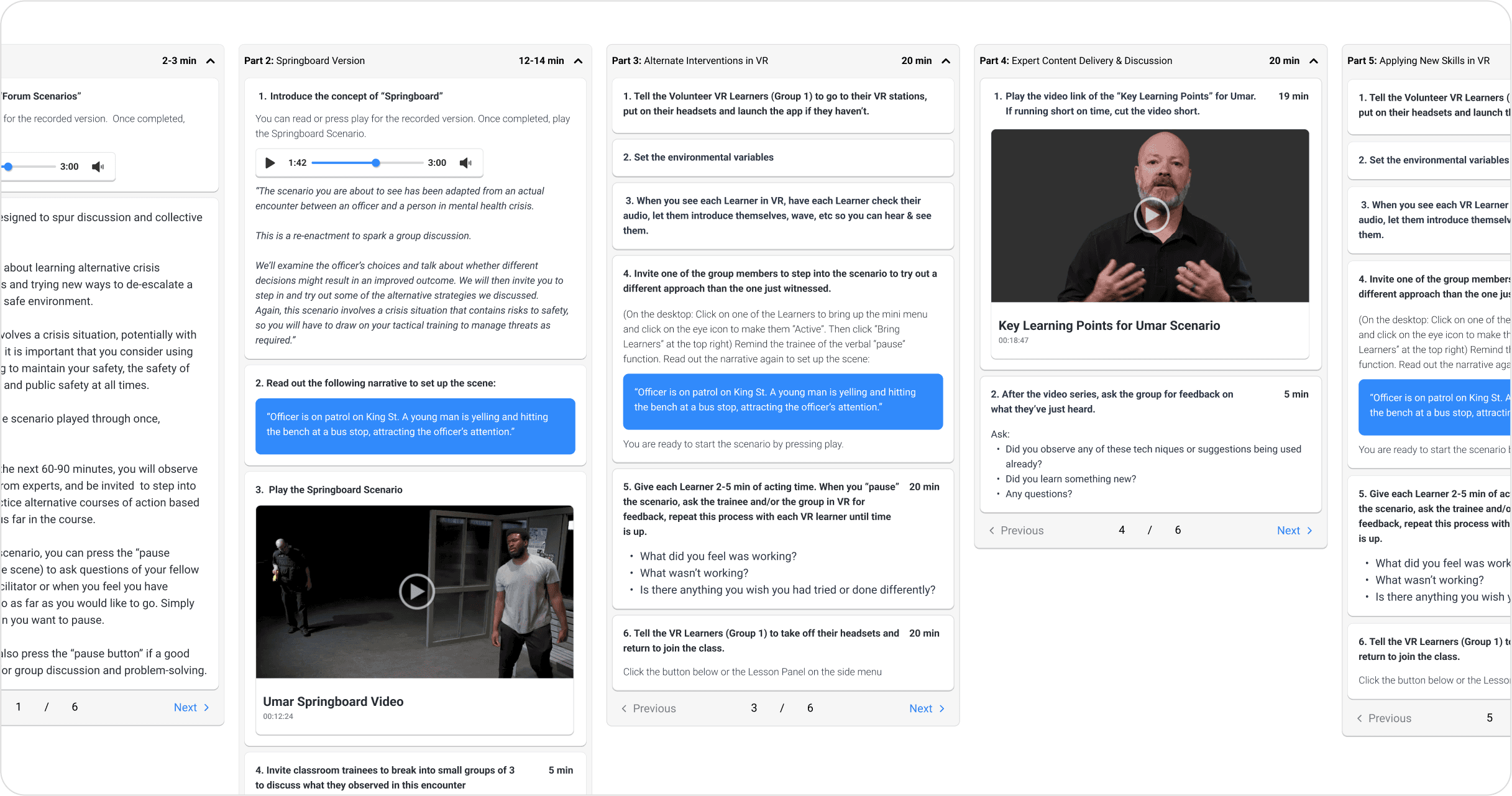
We added a full-screen overlay mode to the camera feature to give trainers a more detailed look at the environment, and gain more granular insights about the scenario at any given momemt.
4
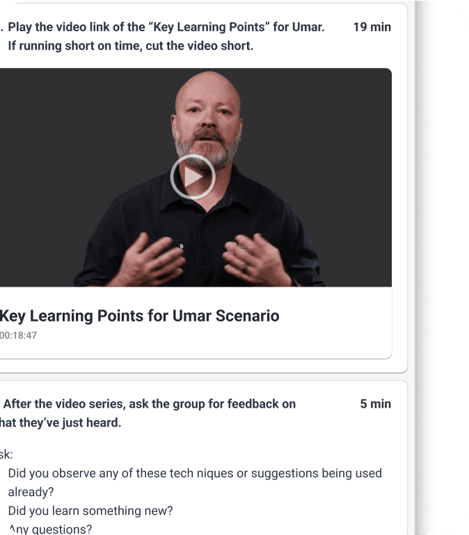
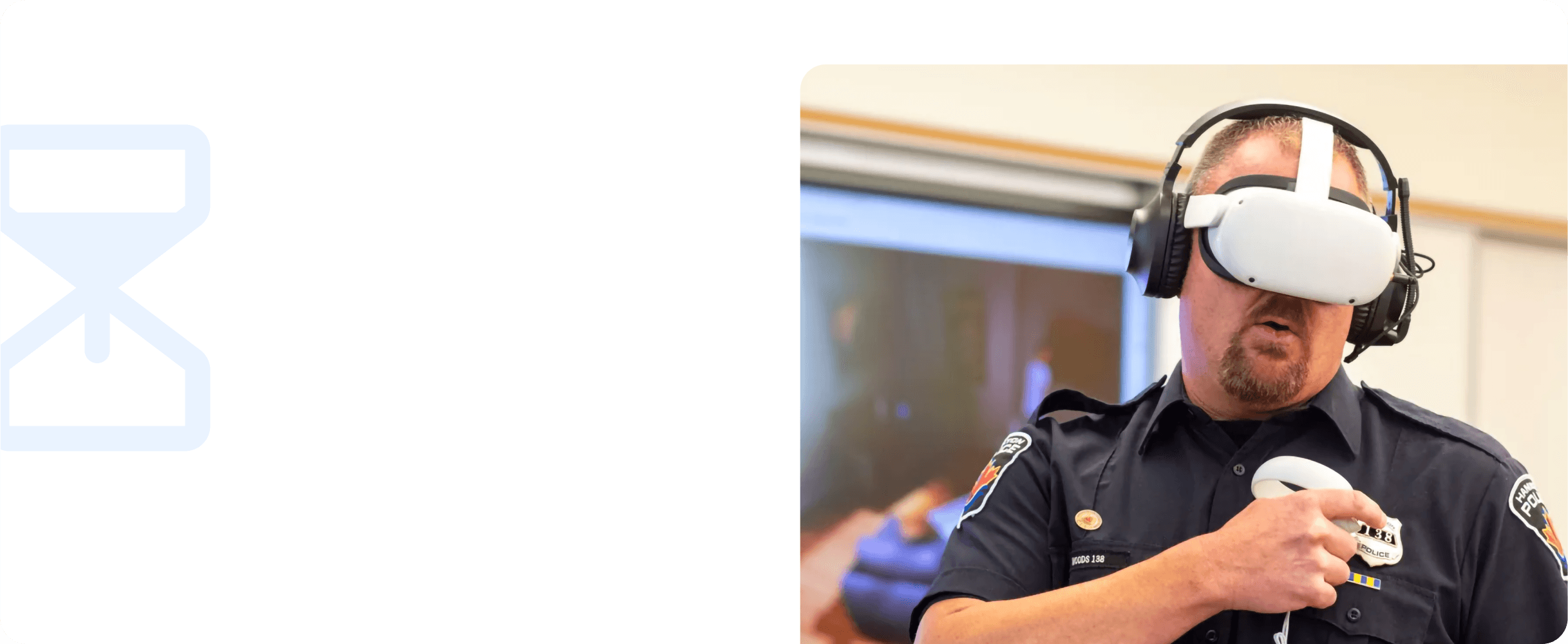
Immersive pre-training tutorials
Partnering with the Art team and Engineering, we developed a series of in-VR tutorials to accompany Oculus’ onboarding experiences. These served to quickly and efficiently teach and reinforce interactions found in the De-escalation scenarios, as well as give Learners a more gradual introduction to the VR environment.
Additionally this helped reduce the burden of Trainers to teach and troubleshoot basic interactions and VR fundamentals among their Learners, allowing them to focus on the cirriculum.
Post launch
Mid-development downsizing
While these changes were in development, Lumeto suffered a substantial wave of layoffs, affecting myself along with four other members of the design team, an 80% reduction in personnel, and impacting 45% of the entire organization.
Based on prototype testing with early adopters, the proposed changes were enthusiastically received, and the following results were observed.

1
25%
Less user error
Clearer actions for the Person in Crisis allowed greater intentionality from our Trainers, and more graceful error recovery
2
25%
Faster acclimation
Additional tutorials paired with a increased learnability in the Trainer interface allowed Services to get up and running faster
3
80%
Less time spent during navigation
More effective pre-set cameras, paired with a more intuitive method of interaction allowed trainers more time to focus on controlling the Person in Crisis
4
50%
Increased satisfaction
Between our previously onboarded early adopters, and newly acquired Police Services, the new changes were well recieved
You might also like...
Redesigning Lumeto’s desktop interface for immersive VR roleplay
Date: Jan 2022 - June 2022
Role: UX Designer, UX Researcher
How it works
1
Immersive VR Training
Learners roleplay to de-escalate mental health crisis scenarios
1
Immersive VR Training
Learners roleplay to de-escalate mental health crisis scenarios
2
6 Unique Scenarios
2
6 Unique Scenarios
3
Interactive Person in Crisis
Trainers control the actions and responses of the person in crisis to test their learners from our desktop app.
3
Interactive Person in Crisis
Trainers control the actions and responses of the person in crisis to test their learners from our desktop app.
Impact

1
25%
Less user error
Clearer actions for the Person in Crisis allowed greater intentionality from our Trainers, and more graceful error recovery
1
25%
Less user error
Clearer actions for the Person in Crisis allowed greater intentionality from our Trainers, and more graceful error recovery

2
25%
Faster acclimation
Additional tutorials paired with a increased learnability in the Trainer interface allowed Services to get up and running faster
2
25%
Faster acclimation
Additional tutorials paired with a increased learnability in the Trainer interface allowed Services to get up and running faster

3
80%
Less time spent during navigation
More effective pre-set cameras, paired with a more intuitive method of interaction allowed trainers more time to focus on controlling the Person in Crisis
3
80%
Less time spent during navigation
More effective pre-set cameras, paired with a more intuitive method of interaction allowed trainers more time to focus on controlling the Person in Crisis

4
50%
Increased satisfaction
Between our previously onboarded early adopters, and newly acquired Police Services, the new changes were well recieved
4
50%
Increased satisfaction
Between our previously onboarded early adopters, and newly acquired Police Services, the new changes were well recieved
My role
Boost engagement and retention among new users
Following the launch of the Crisis Response product, our LiveOps team began engaging with newly acquired Police Services and began onboarding them to our product. Early in to this process, we were noticing an issue with user retention.
Boost engagement and retention among new users
Following the launch of the Crisis Response product, our LiveOps team began engaging with newly acquired Police Services and began onboarding them to our product. Early in to this process, we were noticing an issue with user retention.

1
Low retention rate among new users
Our data suggested that Police Services that had not participated in previous testing rounds, or that were outside of our early adopters were experiencing a decrease in product usage shortly after onboarding.
1
Low retention rate among new users
Our data suggested that Police Services that had not participated in previous testing rounds, or that were outside of our early adopters were experiencing a decrease in product usage shortly after onboarding.

2
Low engagement rate
Among many of the new Police Services onboarded to the product, that rate of use of the product was significantly less than our earlier adopters.
2
Low engagement rate
Among many of the new Police Services onboarded to the product, that rate of use of the product was significantly less than our earlier adopters.
Research
Live user testing at our studio
Live user testing at our studio

Research data collected and analyzed in dovetail
Research data collected and analyzed in dovetail
Usability test footage
37 hours
Participants
43 users

Insights
2
Insufficient emphasis of critical features
Trainers found that the vast majority of their attention was directed at the Dialogue and Actions, diverting their attention from the Viewport and the actions of the Learner.
In order to allow the trainer to make intentional decisions about the actions of dialogue of the Person in Crisis, they needed to be presented with as much relevant information as possible without an unnecessary increase in cognitive load. We needed to present this information in a way that was intuitive yet rich and informative.
3
Ineffective user guides
Trainers found the facilitation guide hard to navigate, difficult to read, and ineffective while interacting with Learners mid-scenario. With the guide constrained to the sidebar, a user would not be able to read the guide and control the Person in Crisis without needing to scroll back and forth between each feature.
Due to the fast-paced nature of the Trainer’s interactions with the Learner, we needed to ensure the Person in Crisis Control Panel UI only emphasized elements and information that was critical and urgent during simulation.
4
Unintuitive navigation
The pre-set camera controls were both ineffective for Trainers and unintuitive to navigate. An update to their design had been previously de-scoped, causing the feature to be significantly outdated. Additionally, while using the WASD control scheme for navigation is standard among games and other desktop experiences, it represented a significant learning curve for Trainers unfamiliar with this paradigm.
1
Underfunded Police Services have less time for training
Participating in the live onboarding process allowed me face-to-face time with our users to observe them using the product as well as conduct interviews and collect survey data. It was discovered that many of the smaller, less funded Police Services had far less time for training and practice than was anticipated.
These users were finding the intricacies of the new curriculum, the new training modality, along with the learning curve of the software to be overwhelming.
Final design
1
Dialogue brought into focus
By removing other features from the sidebar, we were able to maximize the space for Actions and Dialogue. A variety of treatments were applied to actions such as, a longer text field, icons to denote action type, an animating status bar while the action is in use. This drastically increased visibility as well allowing the Trainer to make more informed and intentional decisions while controlling the Person in Crisis without increasing their cognitive load.
Dialogue
Action
Variable
Looping
Movement
Key Action

2
Guidance only when you need it
The facilitation guide was only needed during stages of the simulation when learner's weren't roleplaying in VR. It made sense to separate it from the Actions and Dialogue panel so the two features wouldn't be competing with one another for space or attention
2
Guidance only when you need it
The facilitation guide was only needed during stages of the simulation when learner's weren't roleplaying in VR. It made sense to separate it from the Actions and Dialogue panel so the two features wouldn't be competing with one another for space or attention


3
Navigation made easy
Trainers can switch between pre-set camera positions by clicking their position on the mini-map.
3
Navigation made easy
Trainers can switch between pre-set camera positions by clicking their position on the mini-map.
4
Immersive pre-training tutorials
Partnering with the Art team and Engineering, we developed a series of in-VR tutorials to accompany Oculus’ onboarding experiences. These served to quickly and efficiently teach and reinforce interactions found in the De-escalation scenarios, as well as give Learners a more gradual introduction to the VR environment.
Additionally this helped reduce the burden of Trainers to teach and troubleshoot basic interactions and VR fundamentals among their Learners, allowing them to focus on the cirriculum.
Make tactical decisions faster with top-down map overlay
We added a full-screen overlay mode to the camera feature to give trainers a more detailed look at the environment, and gain more granular insights about the scenario at any given momemt.
Post launch
1
25%
Less user error
Clearer actions for the Person in Crisis allowed greater intentionality from our Trainers, and more graceful error recovery
1
25%
Less user error
Clearer actions for the Person in Crisis allowed greater intentionality from our Trainers, and more graceful error recovery
2
25%
Faster acclimation
Additional tutorials paired with a increased learnability in the Trainer interface allowed Services to get up and running faster
2
25%
Faster acclimation
Additional tutorials paired with a increased learnability in the Trainer interface allowed Services to get up and running faster
3
80%
Less time spent during navigation
More effective pre-set cameras, paired with a more intuitive method of interaction allowed trainers more time to focus on controlling the Person in Crisis
3
80%
Less time spent during navigation
More effective pre-set cameras, paired with a more intuitive method of interaction allowed trainers more time to focus on controlling the Person in Crisis
4
50%
Increased satisfaction
Between our previously onboarded early adopters, and newly acquired Police Services, the new changes were well recieved
4
50%
Increased satisfaction
Between our previously onboarded early adopters, and newly acquired Police Services, the new changes were well recieved
Mid-development downsizing
While these changes were in development, Lumeto suffered a substantial wave of layoffs, affecting myself along with four other members of the design team, an 80% reduction in personnel, and impacting 45% of the entire organization.
Based on prototype testing with early adopters, the proposed changes were enthusiastically received, and the following results were observed.
You might also like...
6 min read
Redesigning Lumeto’s desktop interface for immersive VR roleplay
6 min read
Redesigning Lumeto’s desktop interface for immersive VR roleplay

5 min read
Building community engagement with socially responsible events
5 min read
Building community engagement with socially responsible events
Redesigning Lumeto’s desktop interface for immersive VR roleplay
Date: Jan 2022 - June 2022
Role: UX Designer, UX Researcher
How it works
1
Immersive VR Training
Learners in VR roleplay to de-escalate mental health crisis scenarios.
2
6 Unique Scenarios
3
Interactive Person in Crisis
Trainers control the actions and responses of the person in crisis to test their learners from our desktop app.
Impact

1
25%
Less user error
Clearer actions for the Person in Crisis allowed greater intentionality from our Trainers, and more graceful error recovery

2
25%
Faster acclimation
Additional tutorials paired with a increased learnability in the Trainer interface allowed Services to get up and running faster

3
80%
Less time spent during navigation
More effective pre-set cameras, paired with a more intuitive method of interaction allowed trainers more time to focus on controlling the Person in Crisis

4
50%
Increased satisfaction
Between our previously onboarded early adopters, and newly acquired Police Services, the new changes were well recieved
My role
Boost engagement and retention among new users
Following the launch of the Crisis Response product, our LiveOps team began engaging with newly acquired Police Services and began onboarding them to our product. Early in to this process, we were noticing an issue with user retention.

1
Low retention rate among new users
Our data suggested that Police Services that had not participated in previous testing rounds, or that were outside of our early adopters were experiencing a decrease in product usage shortly after onboarding.

2
Low engagement rate
Among many of the new Police Services onboarded to the product, that rate of use of the product was significantly less than our earlier adopters.
Research
Live user testing at our studio
Usability test footage
37 hours
Participants
43 users
Research data collected and analyzed in dovetail
Insights
1
Underfunded Police Services have less time for training
Participating in the live onboarding process allowed me face-to-face time with our users to observe them using the product as well as conduct interviews and collect survey data. It was discovered that many of the smaller, less funded Police Services had far less time for training and practice than was anticipated.
These users were finding the intricacies of the new curriculum, the new training modality, along with the learning curve of the software to be overwhelming.

2
Insufficient emphasis of critical features
Trainers found that the vast majority of their attention was directed at the Dialogue and Actions, diverting their attention from the Viewport and the actions of the Learner.
In order to allow the trainer to make intentional decisions about the actions of dialogue of the Person in Crisis, they needed to be presented with as much relevant information as possible without an unnecessary increase in cognitive load. We needed to present this information in a way that was intuitive yet rich and informative.

3
Ineffective user guides
Trainers found the facilitation guide hard to navigate, difficult to read, and ineffective while interacting with Learners mid-scenario. With the guide constrained to the sidebar, a user would not be able to read the guide and control the Person in Crisis without needing to scroll back and forth between each feature.
Due to the fast-paced nature of the Trainer’s interactions with the Learner, we needed to ensure the Person in Crisis Control Panel UI only emphasized elements and information that was critical and urgent during simulation.

4
Unintuitive navigation
The pre-set camera controls were both ineffective for Trainers and unintuitive to navigate. An update to their design had been previously de-scoped, causing the feature to be significantly outdated. Additionally, while using the WASD control scheme for navigation is standard among games and other desktop experiences, it represented a significant learning curve for Trainers unfamiliar with this paradigm.
Final design
1
Dialogue brought into focus
By removing other features from the sidebar, we were able to maximize the space for Actions and Dialogue. A variety of treatments were applied to actions such as, a longer text field, icons to denote action type, an animating status bar while the action is in use. This drastically increased visibility as well allowing the Trainer to make more informed and intentional decisions while controlling the Person in Crisis without increasing their cognitive load.
Dialogue
Action
Variable
Looping
Movement
Key Action
2
Guidance only when you need it
The facilitation guide was only needed during stages of the simulation when learner's weren't roleplaying in VR. It made sense to separate it from the Actions and Dialogue panel so the two features wouldn't be competing with one another for space or attention
3
Navigation made easy
Trainers can switch between pre-set camera positions by clicking their position on the mini-map.
Make tactical decisions faster with top-down map overlay
We added a full-screen overlay mode to the camera feature to give trainers a more detailed look at the environment, and gain more granular insights about the scenario at any given momemt.

4
Immersive pre-training tutorials
Partnering with the Art team and Engineering, we developed a series of in-VR tutorials to accompany Oculus’ onboarding experiences. These served to quickly and efficiently teach and reinforce interactions found in the De-escalation scenarios, as well as give Learners a more gradual introduction to the VR environment.
Additionally this helped reduce the burden of Trainers to teach and troubleshoot basic interactions and VR fundamentals among their Learners, allowing them to focus on the cirriculum.
Post launch
Mid-development downsizing
While these changes were in development, Lumeto suffered a substantial wave of layoffs, affecting myself along with four other members of the design team, an 80% reduction in personnel, and impacting 45% of the entire organization.
Based on prototype testing with early adopters, the proposed changes were enthusiastically received, and the following results were observed.

1
25%
Less user error
Clearer actions for the Person in Crisis allowed greater intentionality from our Trainers, and more graceful error recovery
2
25%
Faster acclimation
Additional tutorials paired with a increased learnability in the Trainer interface allowed Services to get up and running faster
3
80%
Less time spent during navigation
More effective pre-set cameras, paired with a more intuitive method of interaction allowed trainers more time to focus on controlling the Person in Crisis
4
50%
Increased satisfaction
Between our previously onboarded early adopters, and newly acquired Police Services, the new changes were well recieved
Interested in working together? Lets chat!
Interested in working together? Lets chat!
Interested in working together? Lets chat!